The Whole Ball of Wax Response
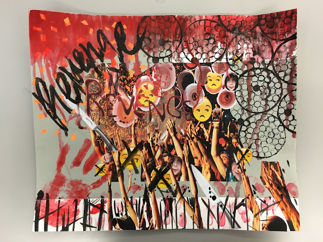
In Jerry Saltz's article, in the first couple sentences he mentions two curators whom make a bold statement of "art has the ability to change the world". After reading this article, I couldn't help, but agree. While reading this it took me back to a time when I was taking an art history class in high school. Our first class period, my teacher asked us what we associate art with. We went around the room and the similar answers came about, such as "paintings, museums, sculptures, etc." Then my teacher approached a desk, knocked on it and asked, "Now, is this a piece of art?" No one is my class rose their hand except for me. She asked me why I rose my hand and I said "Because anything can be art." Art can be a simple desk, a song, a painting, a poem etc. and all these things have the ability to change the world in small or big ways. Saltz addresses the fact that art may not be able to change global warming or cure a disease, but it does cha...


Comments
Post a Comment